IPSEN
Brand refresh
How do you balance heritage and innovation with a brand refresh?
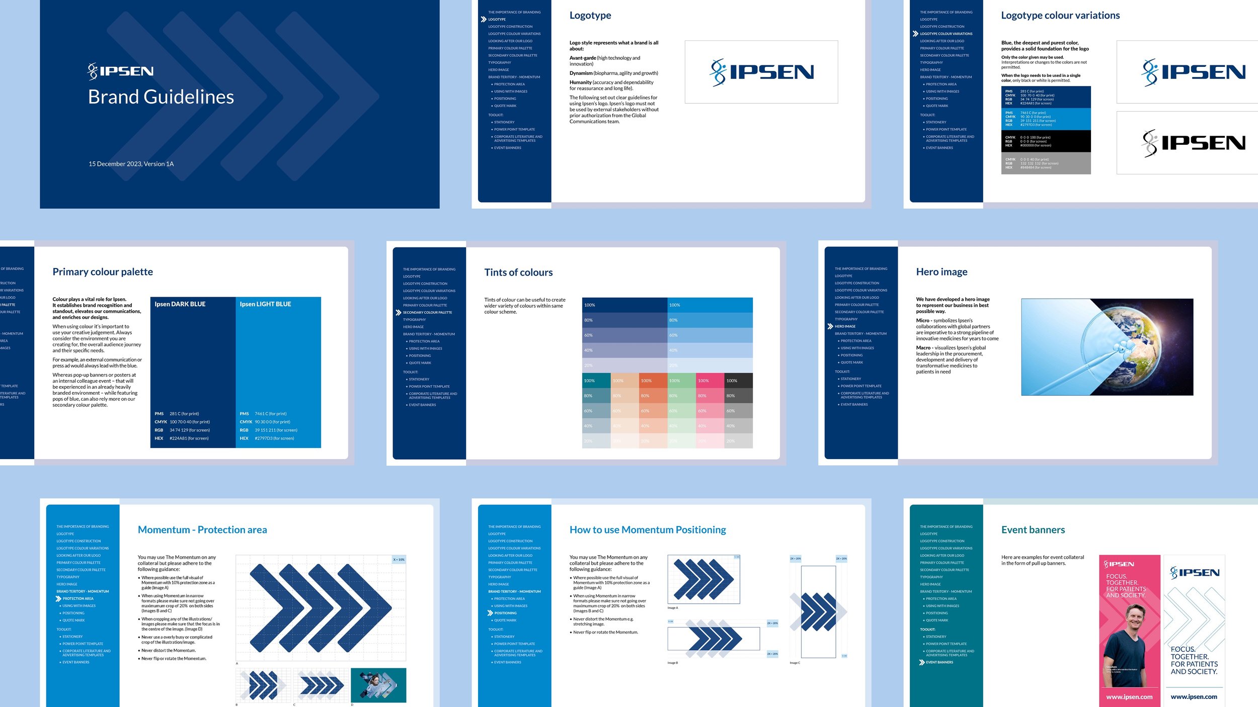
Ipsen’s logo was created 20 years ago when they were first listed on the Paris stock exchange and has been unchanged ever since. With the businesses focus still firmly on innovation for patient care, they were looking for a refresh that visually represented what this means in a modern world.
We undertook a full brand refresh, building comprehensive guidelines that covered logo, colour theory and execution, photography treatments and new graphic elements that demonstrated the brand positioning and ensured the Ipsen brand stays fresh and relevant in a constantly evolving world.